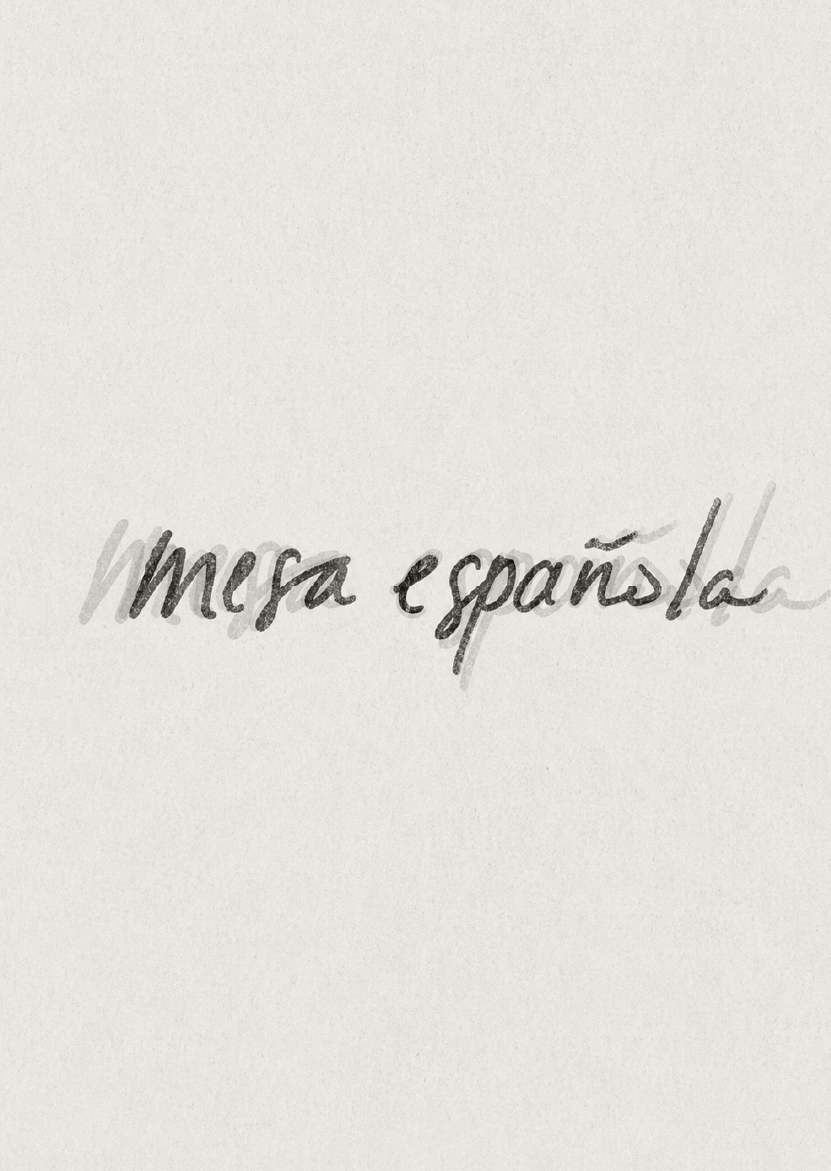
Mesa Española
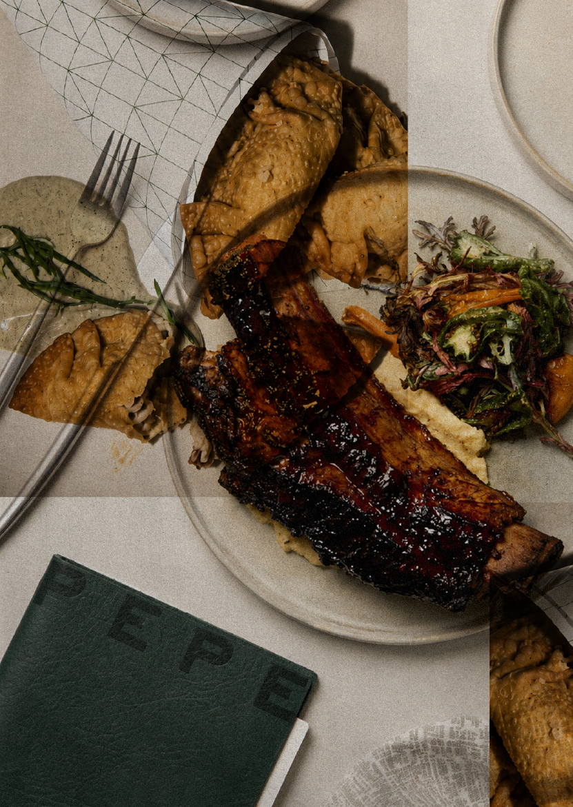
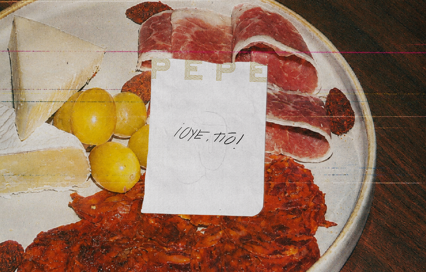
PEPE takes shape around the rituals of gathering: crowded tables, shared plates, long conversations and the familiar chaos in between.
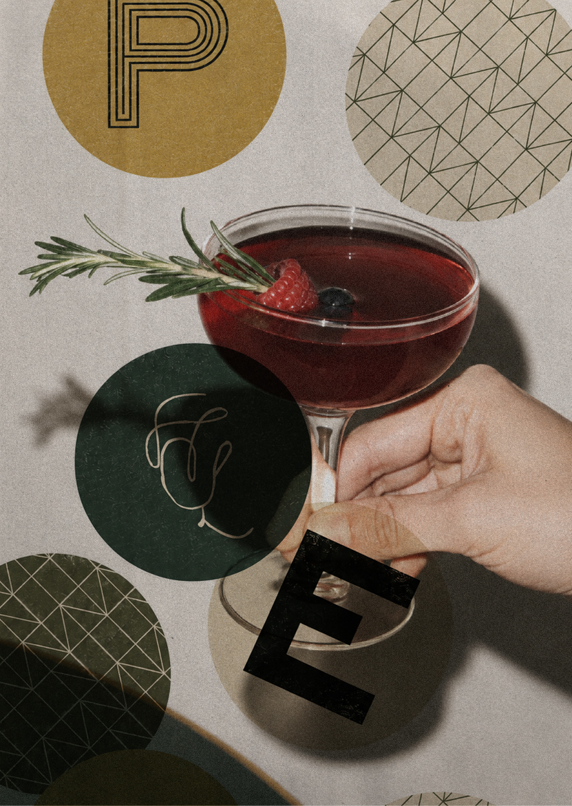
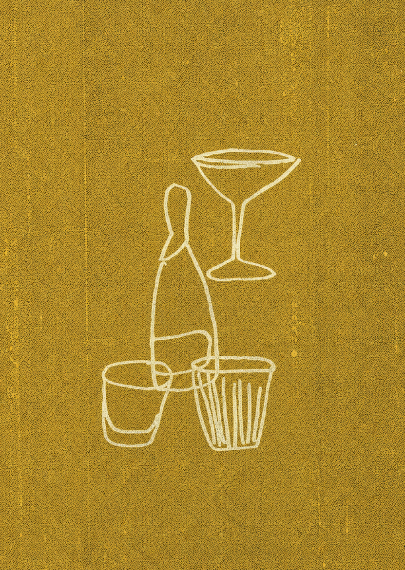
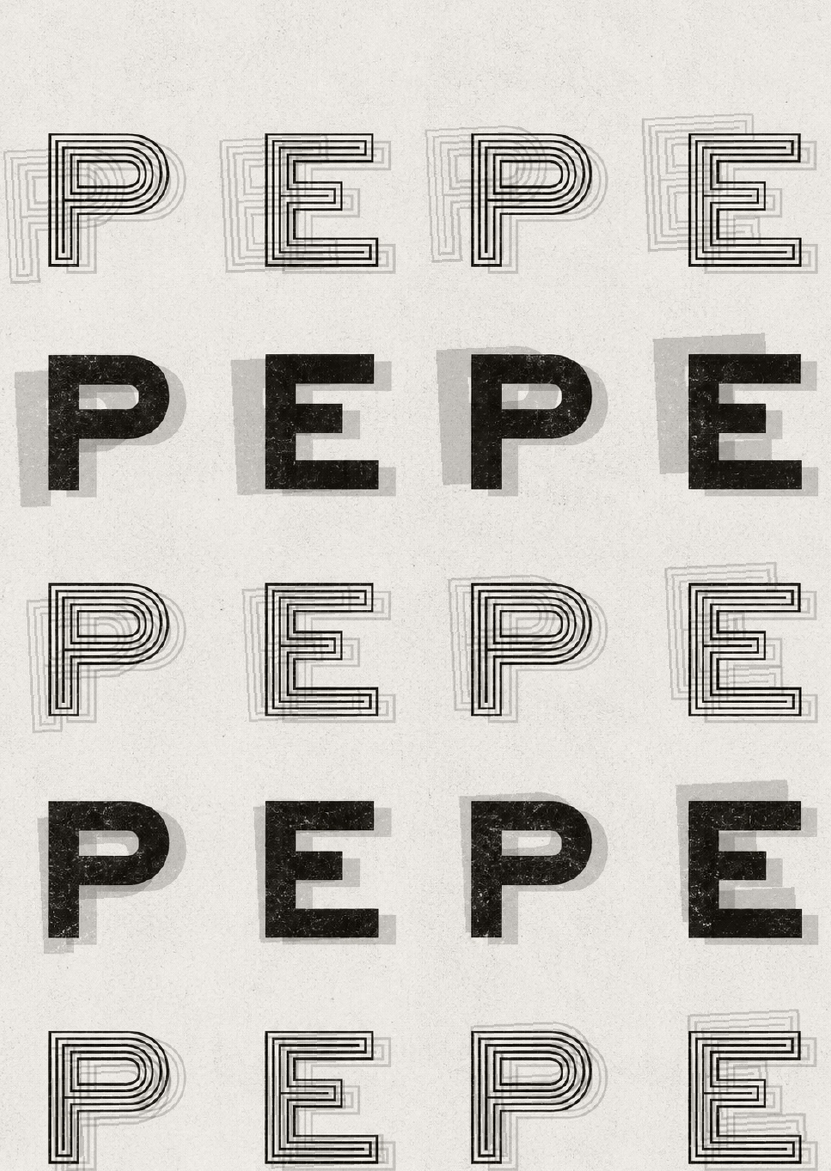
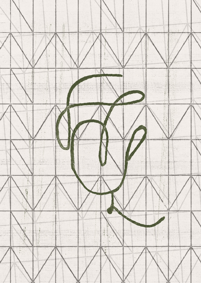
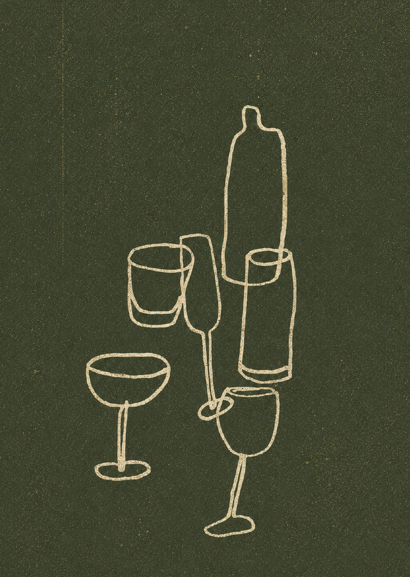
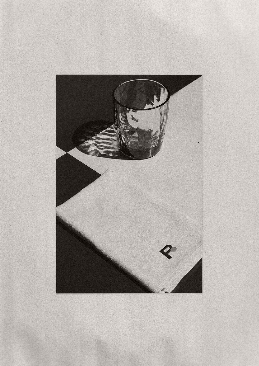
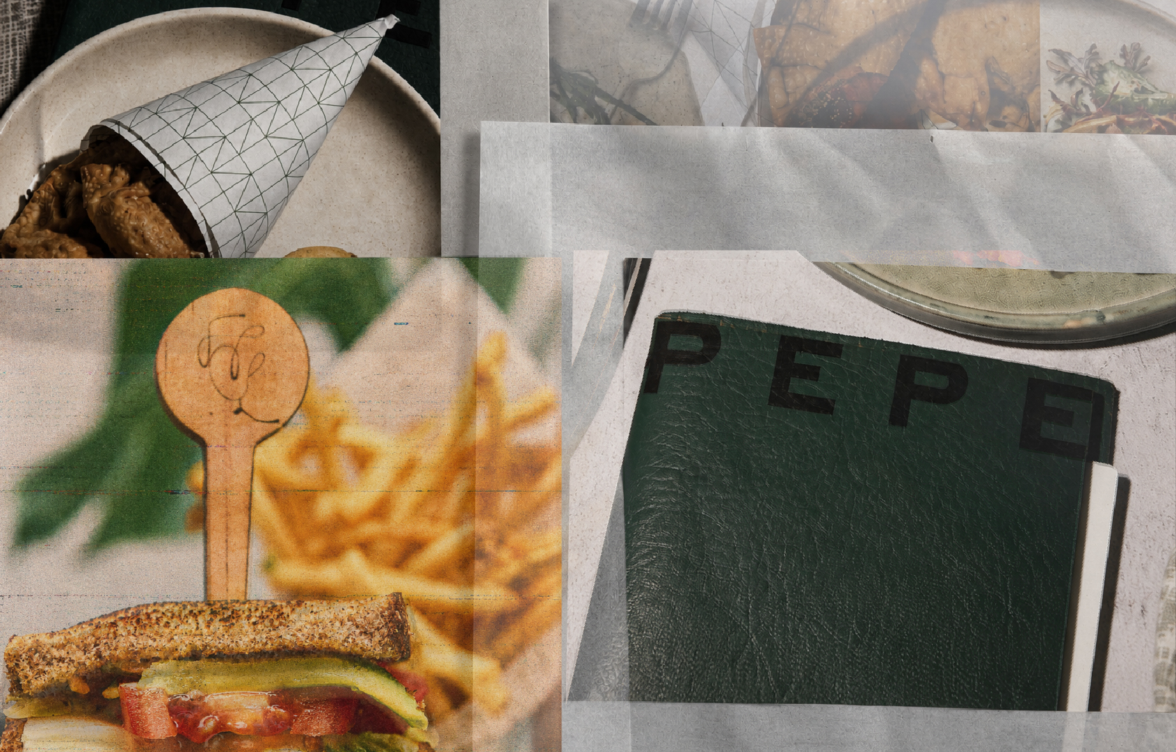
The identity translates that spirit into a visual world of deep greens, flashes of yellow, bold typography, tactile textures and hand-drawn illustrations. References overlap and repeat across menus, objects and printed matter, building a language that feels collected over time.
A little loud, a little imperfect and always meant to be shared.